
How to Make Your Rental Home Look Expensive With Colour
There’s a myth that expensive-looking interiors require expensive ingredients — high ceilings, original features, perfect proportions.
They don’t.
To make your rental look expensive, all you actually require is depth. And depth comes from how you layer colour — not from the architecture behind it. This is the technique interior designers use, and it works just as well in a rental home as it does in a period property.
Why most rental homes look flat
A standard rental starts with white or magnolia walls, neutral carpets, and whatever furniture you’ve collected over time. The result is usually a room that feels thin — like everything is sitting on the surface rather than belonging together.
The culprit is contrast. When colours in a room have nothing in common — bright white walls, cool grey carpet, warm wood furniture, a navy sofa — the eye has nowhere to rest. The room reads as a collection of individual items rather than a cohesive space.
Expensive-looking rooms do the opposite. They create harmony through tone.

What tonal layering actually means
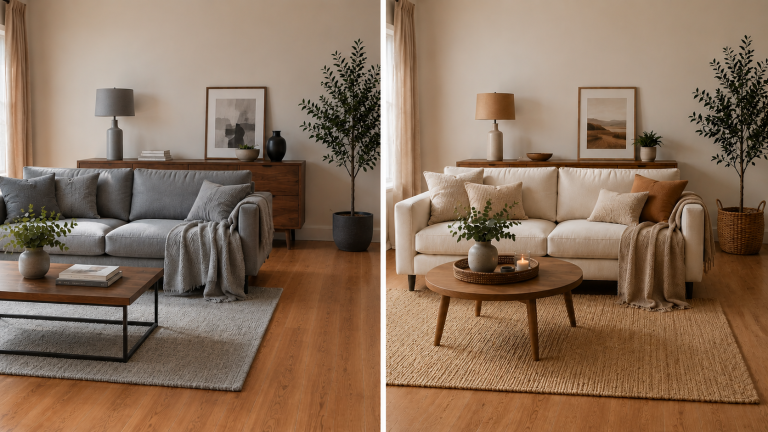
Tonal layering means building a room around different shades of the same colour family rather than mixing unrelated colours together.
Instead of white, grey, and navy — imagine cream, taupe, and mushroom. Instead of cool grey and stark white — warm linen, soft stone, and aged ivory.
Every element shares an undertone. The result is a room that reads as intentional and considered — which is exactly what expensive looks like.
How to do it without painting
The obvious way to create a tonal room is to paint the walls. As a renter, that’s usually not an option. But the walls are only one surface — and often not the most important one.
Here’s where to focus instead:
Curtains are one of the most underrated tools in a rental home. Floor-to-ceiling curtains in a tone that matches or closely relates to your sofa instantly creates a seamless, designed look. The eye reads the two elements as connected.
Rugs anchor the whole room and set the tonal foundation. Choose one that pulls the undertones of your largest pieces together rather than contrasting against them.
Soft furnishings — cushions, throws, and blankets — are where you layer the shades. Go lighter and darker within the same family rather than introducing new colours.
Furniture can be updated more affordably than most people realise. A thrifted piece painted in exactly the right shade to match your palette is one of the most effective tonal moves you can make.
Texture is tonal layering’s best friend
A room in all one shade of the same colour can feel flat in a different way — monochromatic but lifeless.
The solution is texture. When you layer linen, velvet, wool, and cotton in the same tonal family, the different materials catch light differently and create visual interest without disrupting the harmony.
A cream linen cushion, a chunky cream knit throw, and a cream velvet cushion are all the same colour — but together they create a richness that a single flat cream surface never could.
Your starter move
If you’re not sure where to begin, start with one corner of one room.
Choose your dominant tone — the colour that will anchor the space. Then find three things in slightly different shades of that tone: a rug, a throw, and a cushion. Arrange them together and see what happens to the feel of that corner.
That’s tonal layering in practice. Once you see it working at small scale, scaling it up to the whole room becomes much more intuitive.
If you want a structured approach to building your rental colour scheme from scratch, my Colour Guide for Renters walks through exactly this — including how to identify your dominant tone and build out from there.
Watch the full video over on YouTube for a visual walkthrough.