Stop Fighting Your Ugly Rental Floors — Do This Instead
You move in, you unpack, and then you really look at the floor. Orange laminate. Brown carpet. Lifeless grey tiles. Whatever the landlord left behind, it wasn’t what you’d have chosen.
The instinct is to fight those ugly rental floors — cover them up, work around them, or resign yourself to living with something you hate. But there’s a smarter approach, and it comes from understanding a little colour theory.
You don’t need expensive peel-and-stick tiles or a full room overhaul. You just need the right colour palette — and once you know how to choose it, the floor stops being the problem you thought it was.
Why renters get this wrong
The most common mistake is treating a problem floor as something to contrast against. You have orange laminate, so you bring in cool blues and greys to balance it out.
It feels logical. In practice, it makes things worse.
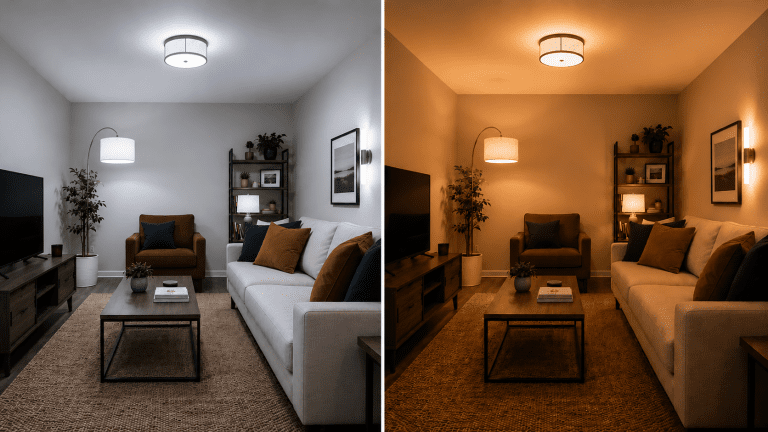
Complementary colours — opposites on the colour wheel — don’t cancel each other out. They intensify each other. Put cool blue furniture on warm orange floors and watch the floor become the only thing anyone notices when they walk into the room.
The colour wheel principle that changes everything
Instead of working against your floor, work with it.
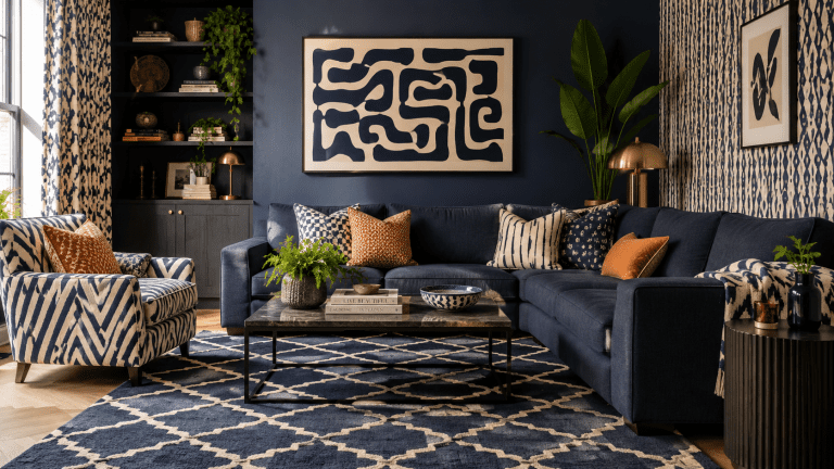
Analogous colours are colours that sit next to each other on the colour wheel — they share undertones and naturally harmonise. When you bring analogous colours into a room, the eye reads them as part of one cohesive palette rather than competing elements.
The result is that the floor stops standing out. It becomes part of the room rather than a problem in the middle of it.
How to diagnose your floor
Before you can fix the problem you need to identify exactly what you’re working with.
Most rental floors fall into one of two camps:
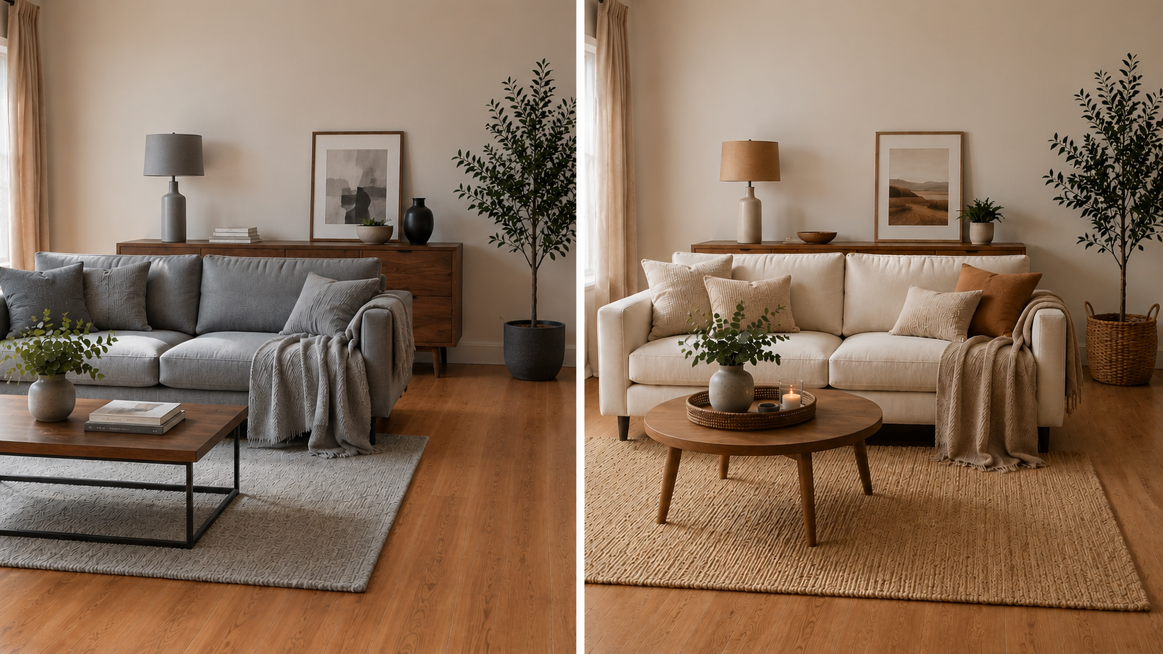
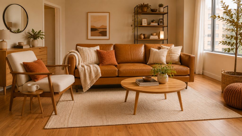
Warm toned — orange laminate, honey coloured wood, brown carpet, terracotta tiles. These floors have yellow, orange, or red undertones.
Cool toned — grey carpet, whitewashed or pale wood, cool stone tiles. These floors have blue, grey, or green undertones.
Hold a white piece of paper next to your floor in natural light. The undertone will become much clearer.
If your floor is warm toned
Work with the warmth rather than against it.
Bring in warm neutrals — think sandy beiges, soft creams, and off-whites rather than bright or cool whites. Layer in earthy tones — terracotta, rust, olive green, warm ochre. These colours share the same undertone family as your floor and pull the whole room into harmony.
Rugs are your most powerful tool here. A large rug in a warm neutral immediately changes how the floor reads — even if it doesn’t cover it completely, it shifts the overall colour temperature of the room.
Soft furnishings, cushions, throws, and curtains in analogous tones do the same job on a smaller scale.
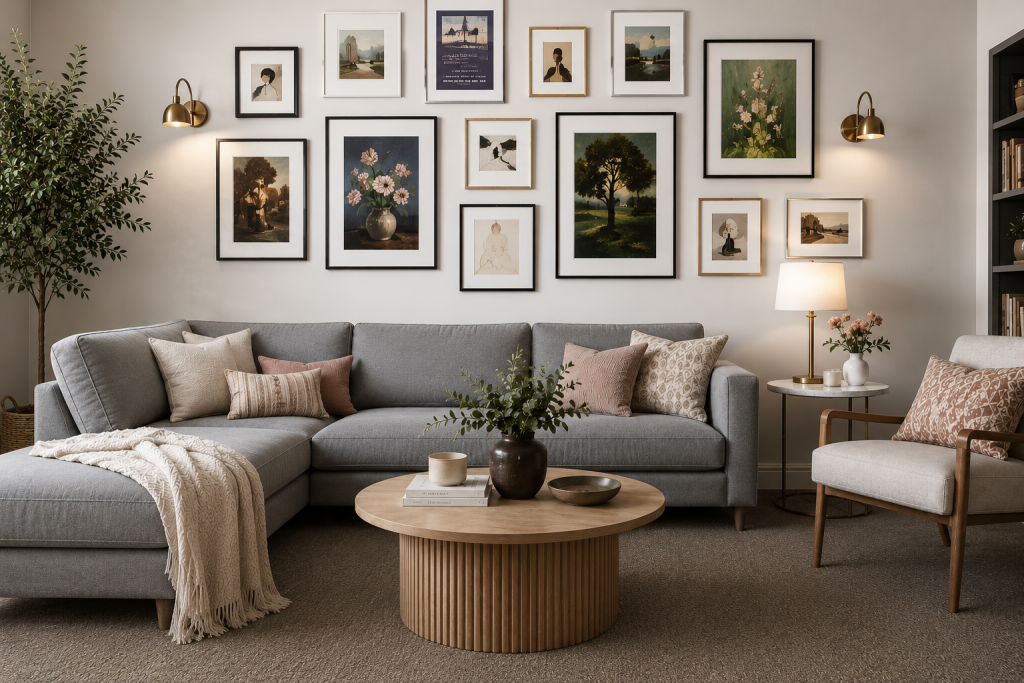
If your floor is cool toned
Cool floors are actually easier to work with than most renters realise.
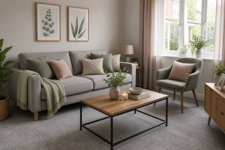
Stick to cool neutrals — soft greys, muted blues, sage greens, and chalky whites. These tones sit comfortably alongside cool floors without creating tension.
The trap to avoid is bringing in warm accents to “add cosiness” — warm yellows, oranges, or terracotta tones will clash with a cool floor rather than complement it. If you want warmth in a cool-toned room, add it through texture — linen, wool, jute — rather than colour.
The distraction method
Sometimes the best solution isn’t harmony — it’s misdirection.
If your floor is genuinely beyond rescuing with colour alone, shift the focus of the room upward. A large piece of art at eye level, a striking pendant light, a gallery wall, or a beautifully styled shelf draws the eye away from the floor entirely.
Pair this with a large rug to minimise the visible floor area and most visitors will never notice the laminate at all.
Putting it into practice
Start with the floor. Identify whether it’s warm or cool toned. Then choose every other colour in the room to work alongside it rather than against it.
You don’t need to replace anything. You don’t need to spend a lot of money. You need to understand the principle — and then apply it consistently through rugs, soft furnishings, and accessories.
If you want to go deeper on choosing a colour palette for your rental home, my Colour Guide for Renters walks you through exactly this process — including how to build a complete colour scheme around the fixed elements you can’t change.
And if you’d prefer to watch rather than read, I cover all of this in detail over on YouTube.