Stop Believing This Colour Rule — Warm vs Cool Rooms Explained
There’s a colour rule almost everyone believes when it comes to decorating: pick a temperature, warm or cool, and commit to it. Mix the two and the room will clash.
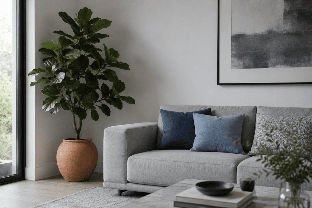
It’s not true. And if your rental has white walls, a grey sofa, and pale neutrals throughout, you’ve probably felt the effect of following that rule a bit too closely — it looks nice, but something’s off. A bit cold. A bit flat. A bit like a showroom nobody actually lives in.
Here’s why that happens, and the much simpler fix.
Warm vs Cool Room Colours – The myth, properly explained
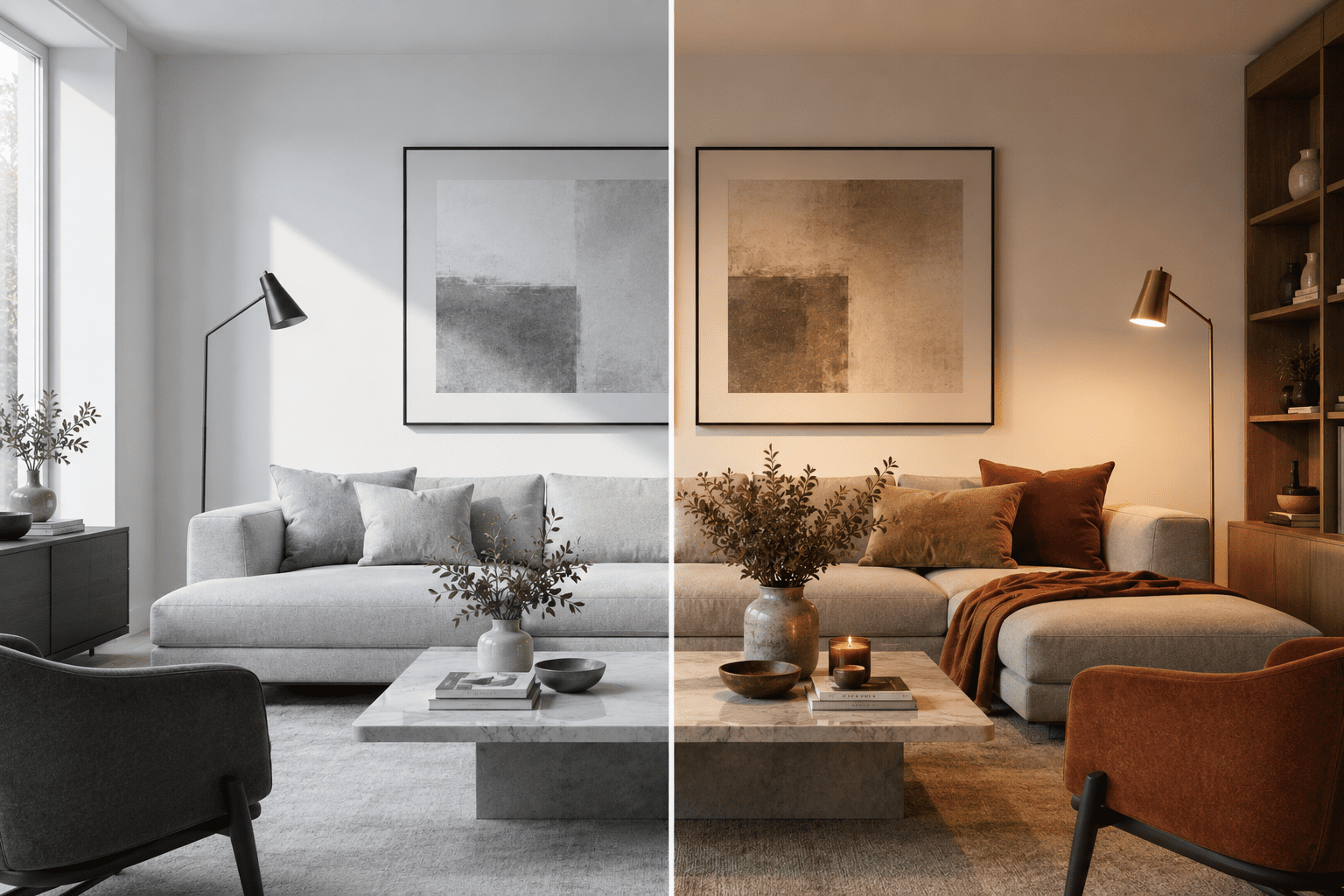
Look at any professionally designed room that feels warm and inviting and it will almost always contain both temperatures. The cool tones create a sense of calm and space. The warm tones are what make it feel like somewhere you actually want to be.
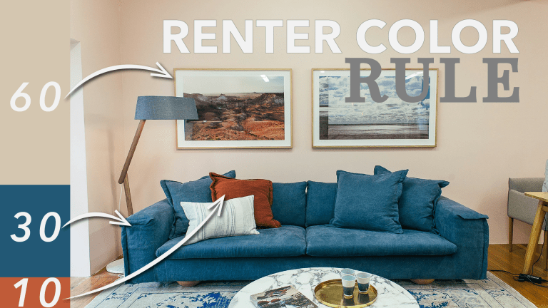
What designers do is choose one temperature to lead — somewhere around 70 to 80 percent of the room — and use the opposite as an accent. The dominant tone sets the mood. The accent tone stops it from feeling one-dimensional.
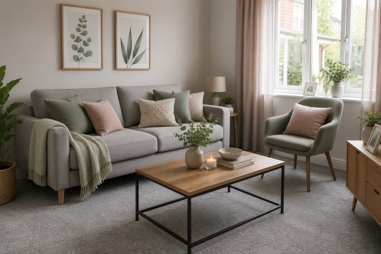
If you’ve already got cool grey furniture and white or off-white walls, you’ve got your foundation sorted. That cool base isn’t a problem to solve. It’s something to build on. A little warmth layered over the top doesn’t create a clash — it creates contrast, and contrast is exactly what gives a room depth.
Why all-cool rooms can feel uncomfortable
All-cool rooms can genuinely look beautiful. White walls, grey sofas, pale floors, a bit of chrome or steel — there’s a reason that look is everywhere. It’s clean, sophisticated, and photographs brilliantly.
But lived in day to day, a lot of people find spaces like that feel clinical. Slightly uncomfortable to actually relax in — more like a hotel lobby than somewhere you live.
Warm accents give the eye somewhere to rest. A wooden coffee table, a camel throw, a woven basket in the corner — these are the things that make a room feel like somewhere you can sit down, kick your shoes off, and stay a while.
Adding warmth doesn’t mean turning a cool room into a warm one. You’re not replacing anything — you’re softening the edges. The cool tones still lead. The warm tones just give them something to play off.
This matters even more if you’re renting. You can’t change the walls, and you probably can’t change the sofa or flooring that came with the property. None of that matters, because warmth doesn’t come from the fixed things — it comes from what you layer on top. That’s where all the real decorating happens, and it’s entirely within your control.
The easy warm elements to add
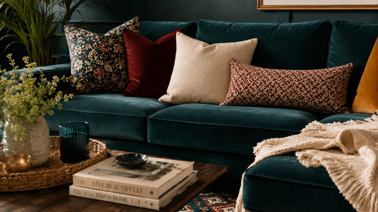
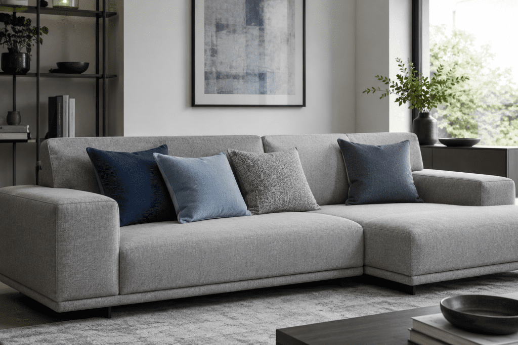
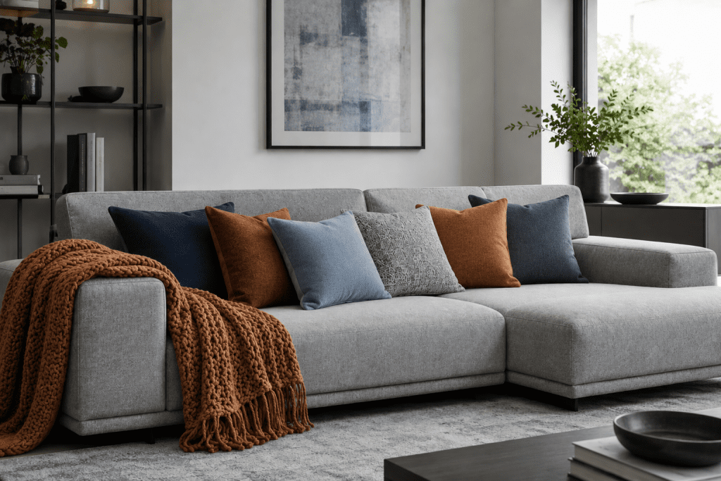
Textiles — cushions and throws. Always start here. Bring in warm neutrals — camel, tan, warm beige, oatmeal, soft terracotta or rust. Two or three warm cushions mixed with cooler ones is enough to shift the whole feeling. A chunky knit throw in camel over the arm of a grey sofa does double duty — warmth and texture together.
Rugs. A rug with a warm base colour or pattern instantly cosies up a cool floor. Even something subtle — a cream and taupe pattern, or a warm jute weave — softens a grey, clinical space considerably.
Wood. A coffee table or side table in oak, walnut, or anything with a touch of honey or amber takes the edge off a sleek, grey room immediately. A small wooden tray or a warm-toned picture frame adds up fast.
Metals. Chrome and silver read as cool. Brass, bronze, and brushed gold read as warm. Swapping a lamp base or a few picture frames for a warm metal finish shifts the overall feeling more than people expect.
Ceramics, objects, and art. Warm-glazed ceramics, amber or terracotta candle holders, a woven basket instead of plastic storage. None of these are dramatic alone, but together they build real warmth.
Plants. Technically green is a cool tone, but plants make cool spaces feel far more alive and balanced. A large plant in a warm-toned pot is one of the easiest wins on this entire list.
Keeping it cohesive
The thing that separates a room that feels intentionally layered from one that feels busy is repetition.
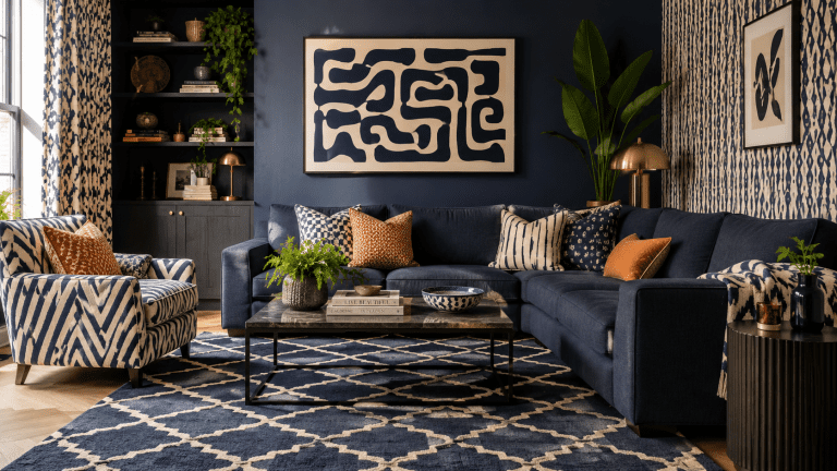
Pick one or two warm tones and let them show up at least three times across the room. Camel and warm brass, for example — a camel throw, a brass lamp, a camel cushion, a small brass tray, maybe a wooden frame. Each piece is subtle alone, but because the warm colour family keeps reappearing, the eye reads it as deliberate rather than random.
Keep your anchor pieces — sofa, largest rug, walls — in the cool family. The warmth lives entirely in the layers on top.
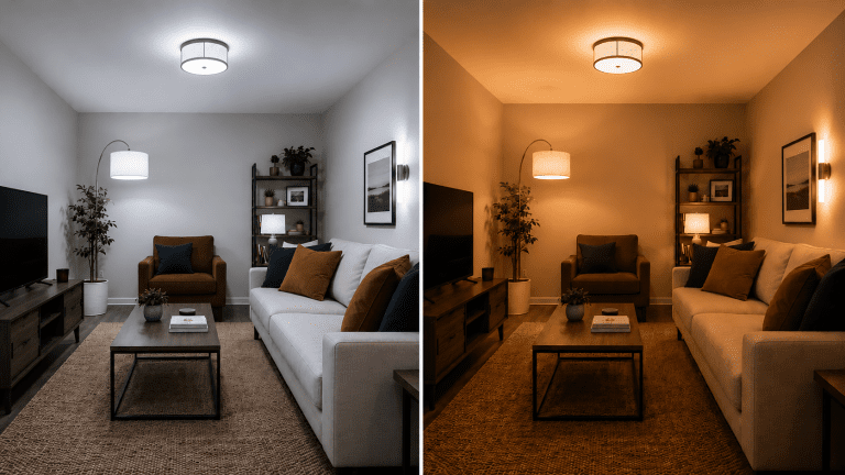
And don’t overlook lighting. A cool white bulb will flatten a room even if everything else is warm-toned. Look for bulbs labelled warm white, around 2,700 Kelvin — that amber glow in the evening does more for cosiness than almost any piece of furniture.
Where to start
A cool-toned room isn’t cold by design. It just needs warmth added in the right places.
Start small — one warm throw, a wooden tray, a brass lamp — and see what it does to the feel of the room. Nine times out of ten, it’s exactly what was missing.
For a complete approach to building your colour scheme — including how warm and cool tones work together across an entire home — my Colour Guide for Renters covers this in depth.
Watch the full video over on YouTube to see the warm-up in action.