The 60-30-10 Rule: The Only Colour Theory Renters Actually Need
Here’s what most people do when they move into a rental: buy a cushion they like, then a throw that sort of goes with it, then a print they found online. Slowly the home fills up with things they like individually — but together, it feels off.
There’s no thread running through it. And it’s hard to figure out why.
The reason is simple. Colour without a system is just noise. The fix is a rule designers have used for decades — and it takes about five minutes to understand properly.
The rule designers use on every single project
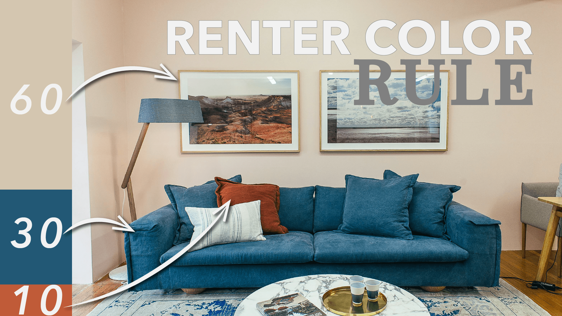
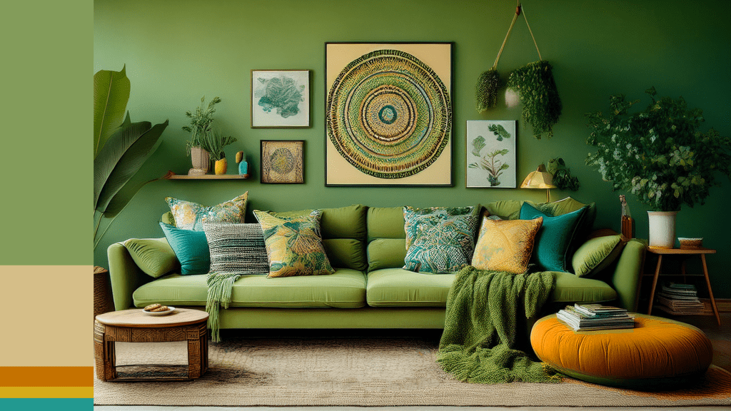
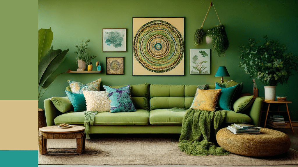
It’s called 60-30-10, and it’s genuinely this simple: every well-designed room needs three colour roles, in three different proportions.
60% is your dominant colour. 30% is your secondary colour. 10% is your accent.
That’s it. Once you understand what belongs in each category, every colour decision in a room becomes far easier to make.
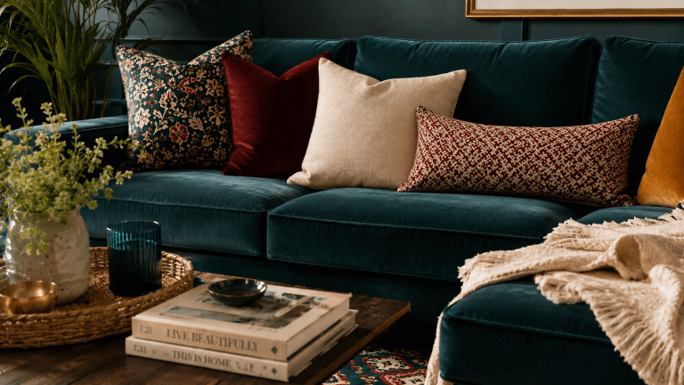
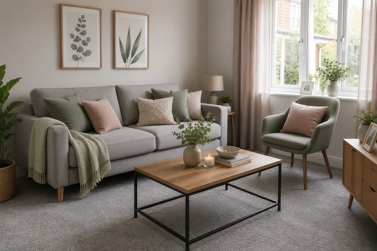
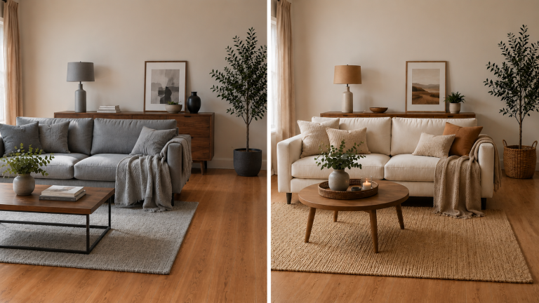
60% — your dominant colour
This is the big stuff. Walls, the largest rug in the room, a sofa if it’s a significant size.
Here’s the good news if you’re renting — this is almost always decided for you already. Magnolia walls? Grey carpet? That’s your 60%, and you don’t need to fight it.
This is the single biggest mindset shift for renters trying to use colour theory. The fixed, unchangeable elements of your home aren’t an obstacle to your design. They’re your starting point. Every colour decision that follows is built around what’s already there.
30% — your secondary colour
This is where your personality starts to come through. Curtains, bedding, a statement chair, a smaller rug layered over a larger neutral one.
The secondary colour is the one that starts to make a room feel like yours rather than a blank canvas. It’s bold enough to notice, but not so dominant that it overwhelms the room.
If your dominant colour is a neutral — which in a rental it usually is — your secondary colour is where you get to actually express a preference. Sage green curtains. Terracotta bedding. A navy accent chair. This is the layer that does the most work in making a space feel intentional.
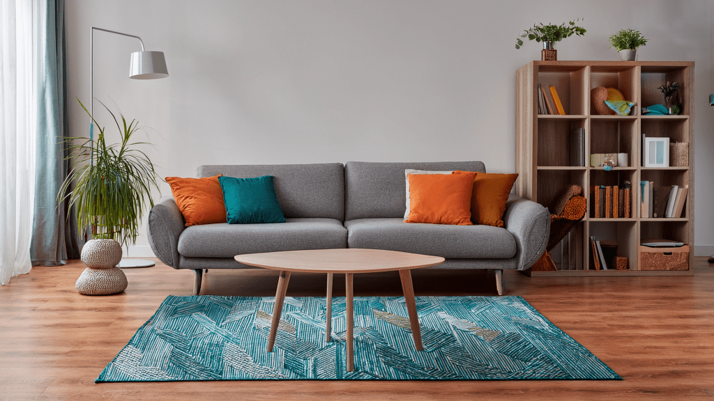
10% — your accent
These are the finishing touches. Cushions, candles, a vase, a single throw.
This is the layer where you’re allowed to go bold. Because 10% is just enough of a room to create a pop of interest without it ever feeling like too much.
This is also the cheapest and easiest layer to change. If you want to update the feel of a room seasonally, or you’re not quite ready to commit to a secondary colour, start here. A few accent pieces in a bold colour will tell you a lot about whether you actually want to commit to that colour at a larger scale.
Why this works so well for renters specifically
Most colour theory advice assumes you’re starting from scratch — choosing your own paint, your own flooring, your own large furniture. As a renter, you’re very rarely doing any of that.
The 60-30-10 rule is one of the few colour frameworks that’s actually more useful when your dominant colour is fixed rather than chosen. It removes the hardest decision — what should my biggest, most expensive colour commitment be — and replaces it with a much simpler one: what do I layer on top of what’s already there.
Putting it into practice
Look at your room right now and identify your existing 60%. Walls, carpet, any large furniture that’s staying.
Choose one secondary colour you actually like and bring it in through curtains, bedding, or a single larger textile.
Then have fun with your 10% — this is genuinely the place to experiment, because it’s the cheapest layer to get wrong and the easiest to change again.
Once you see a room through this lens, you’ll never look at a colour scheme — yours or anyone else’s — the same way again.
If you want a full framework for building a complete palette for your rental home, my Colour Guide for Renters walks through exactly this, alongside how to layer tone and texture on top.
Watch the full video over on YouTube for a visual breakdown of all three layers.